Cerrato palentí
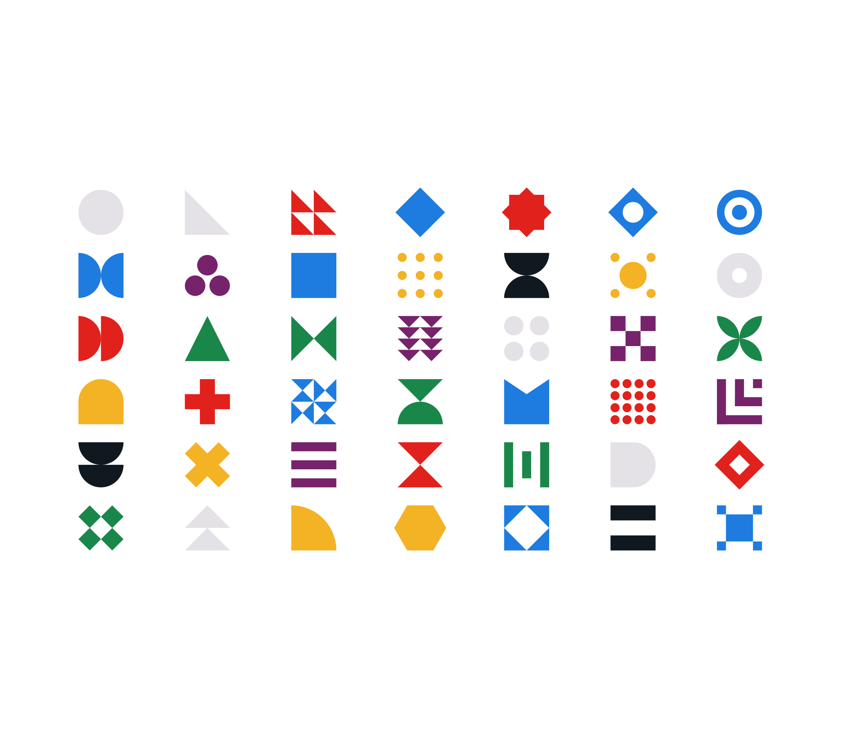
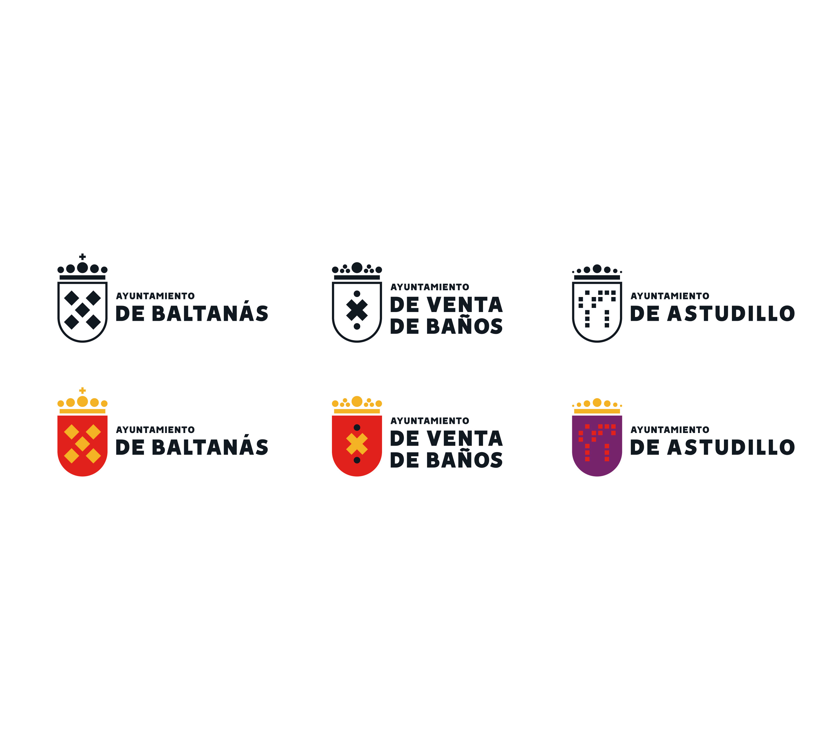
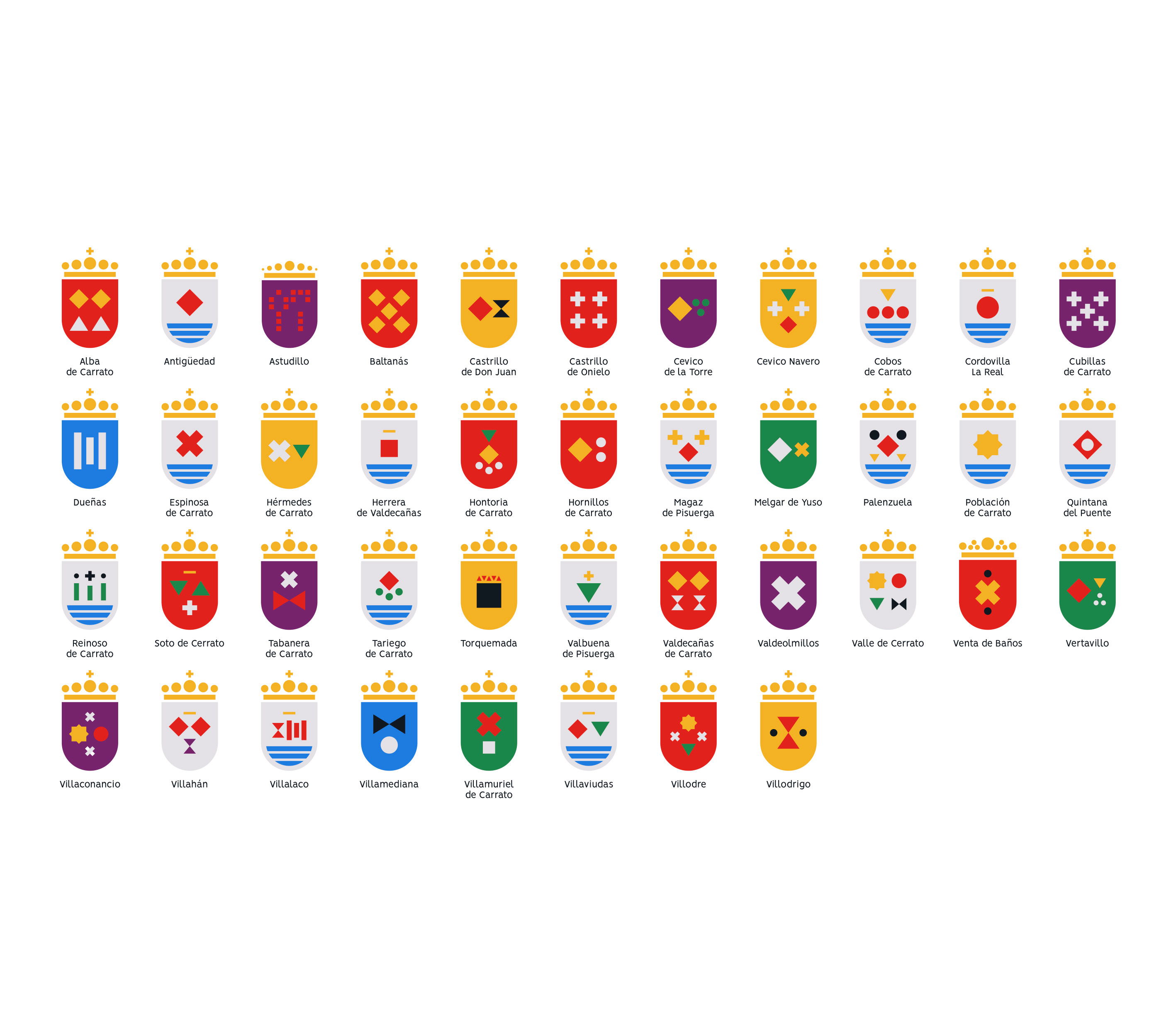
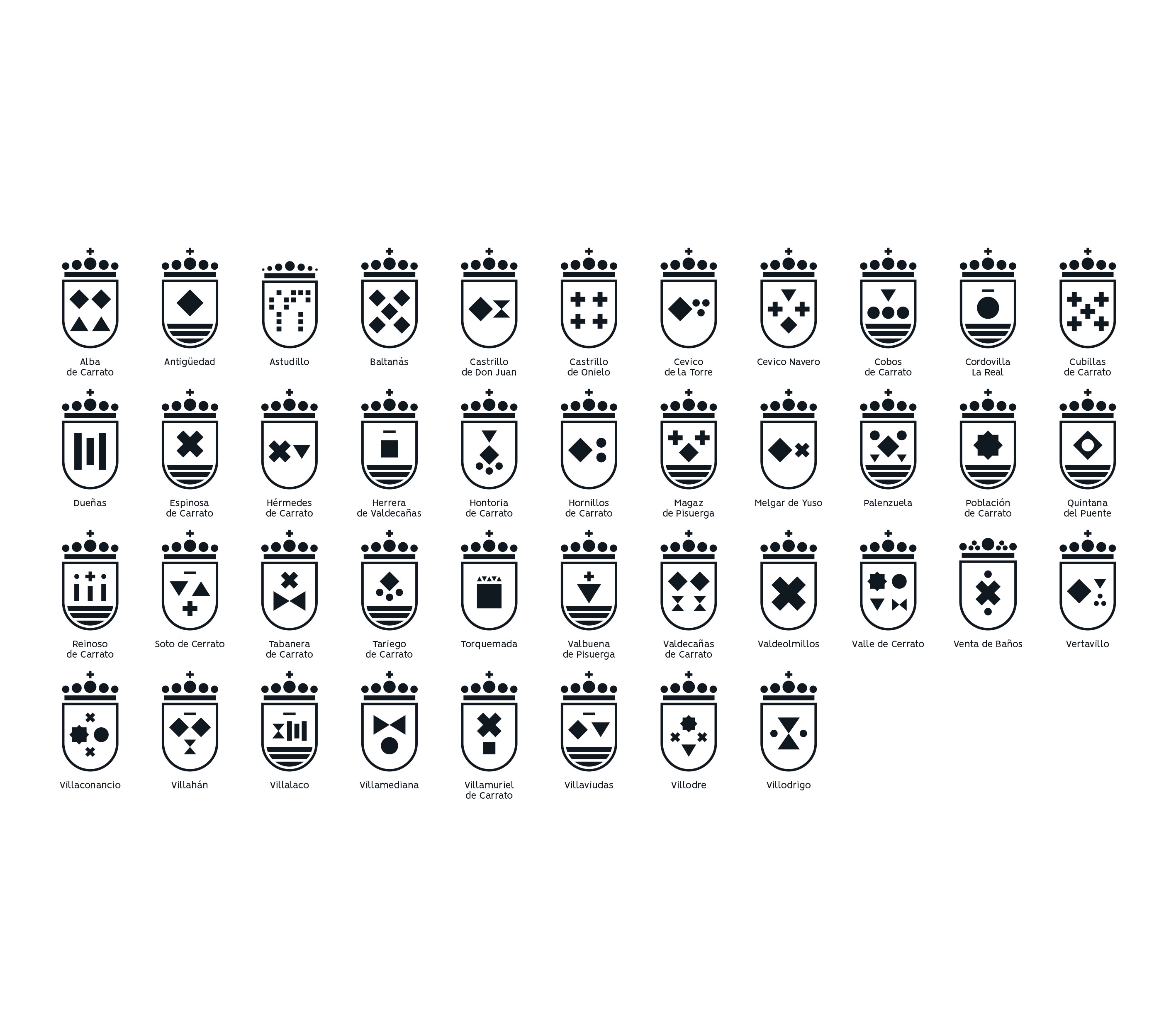
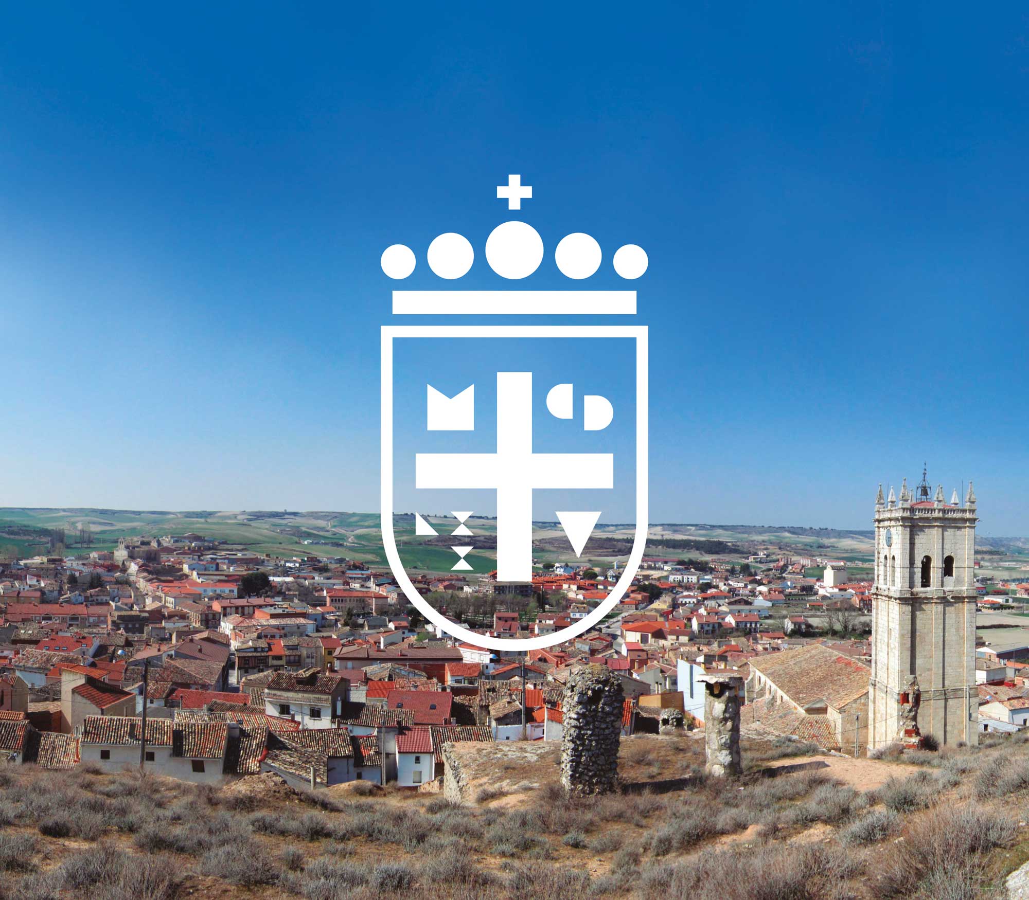
Sens dubte, l’estil visual de la nova marca per al Cerrato palentí és el més interessant que es pot trobar en aquest projecte acadèmic. La identitat gràfica té prou personalitat com per ser reconeguda dins i fora de la regió, sigui per la potència que emana o per la translació de tots els seus elements a formes geomètriques bàsiques. La resta de marques, la dels ajuntaments dels diferents municipis, que es construeixen amb les mateixes formes geomètriques que l’escut de Cerrato, conformen un patró abstracte amb un fort valor estètic. El mateix succeeix amb els colorits esmalts que decoren cada peça, gules, plata, or, azur, sinople, púrpura i sable, que li donen a l’conjunt un brillantor i saturació que no deixa indiferent. Tot això conforma un nou llenguatge visual per a una comarca com la cerratenca, que a hores d’ara necessita imperiosament de tot l’ajut necessari per sobreviure a uns temps poc encoratjadors per a una “Espanya buida” que s’ha de donar a conèixer, no només pel seu ja esmentat patrimoni artístic, històric i natural, sinó pel valor de les seves persones, que formen part activa d’aquesta renovació.
Els canvis que aquí suggereixo no han de ser implementats de forma immediata, ja que poden reflectir-se a la regió a mesura que passi el temps, apareixent quan sigui necessari i permetent avançar de forma segura i sense riscos. D’aquesta manera, la gent percebrà el Cerrato palentí com una cosa que combina modernitat i tradició, associada a uns valors que són constants en el temps però que s’adapten sense dificultat, aconseguint així que es percebi la comarca com un destí tan cool com pot ser qualsevol altre destí europeu.
–
Undoubtedly, the visual style of the new brand for Cerrato palentino is the most interesting aspect of this academic project. The graphic identity has enough personality to be recognized within and beyond the region, either for the power it emanates or for the translation of all its elements into basic geometric shapes. The other brands, those of the town councils of the different municipalities, which are constructed with the same geometric shapes as the Cerrato coat of arms, form an abstract pattern with strong aesthetic value. The colorful enamels that decorate each piece, crimson, silver, gold, azure, sinople, purple, and sable, give the whole ensemble a shine and saturation that cannot be ignored. All of this creates a new visual language for a region like Cerrato, which currently needs all the necessary help to survive in times that are not encouraging for an “empty Spain” that must be known not only for its aforementioned artistic, historical, and natural heritage but also for the value of its people, who are an active part of this renewal.
The changes that I suggest do not have to be implemented immediately, as they can gradually appear in the region over time, when necessary, allowing for safe and risk-free progress. In this way, people will perceive Cerrato palentino as something that combines modernity and tradition, associated with values that remain constant over time but easily adapt, thereby making the region as cool a destination as any other European destination.